DevLog 5 Polish and UI
Polish and UI
This is the fifth devlog for my game, Agent X regarding polish and UI.
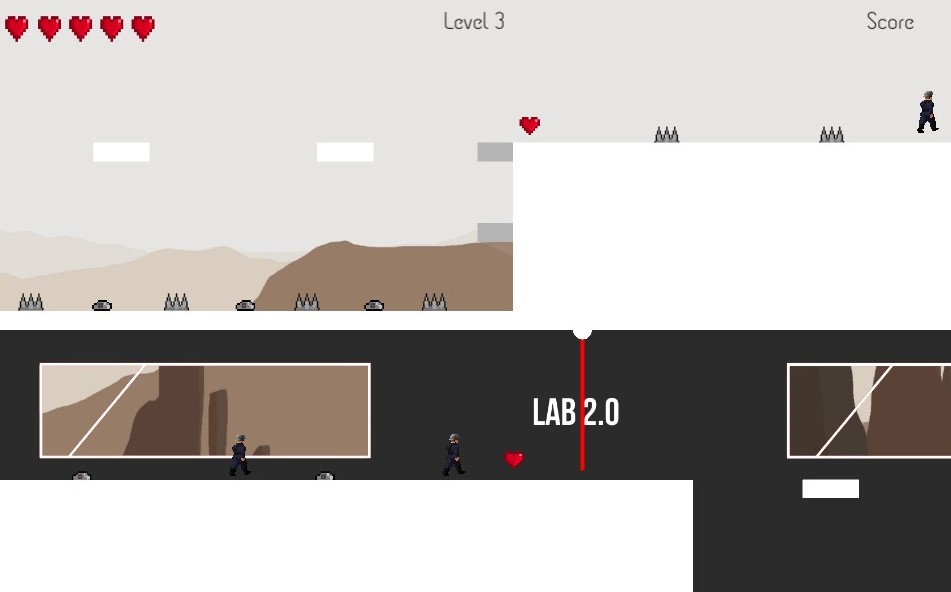
For this checkpoint, I added some new pictures and texts to some levels. For example, I added transparent windows to Level 3 that shows the outside scene in Lab 2 as illustrated in the picture below:
I have also implemented some particle effects whenever the bullet hits the enemies, to indicate that the bullet is dealing damage as shown in the GIF below:

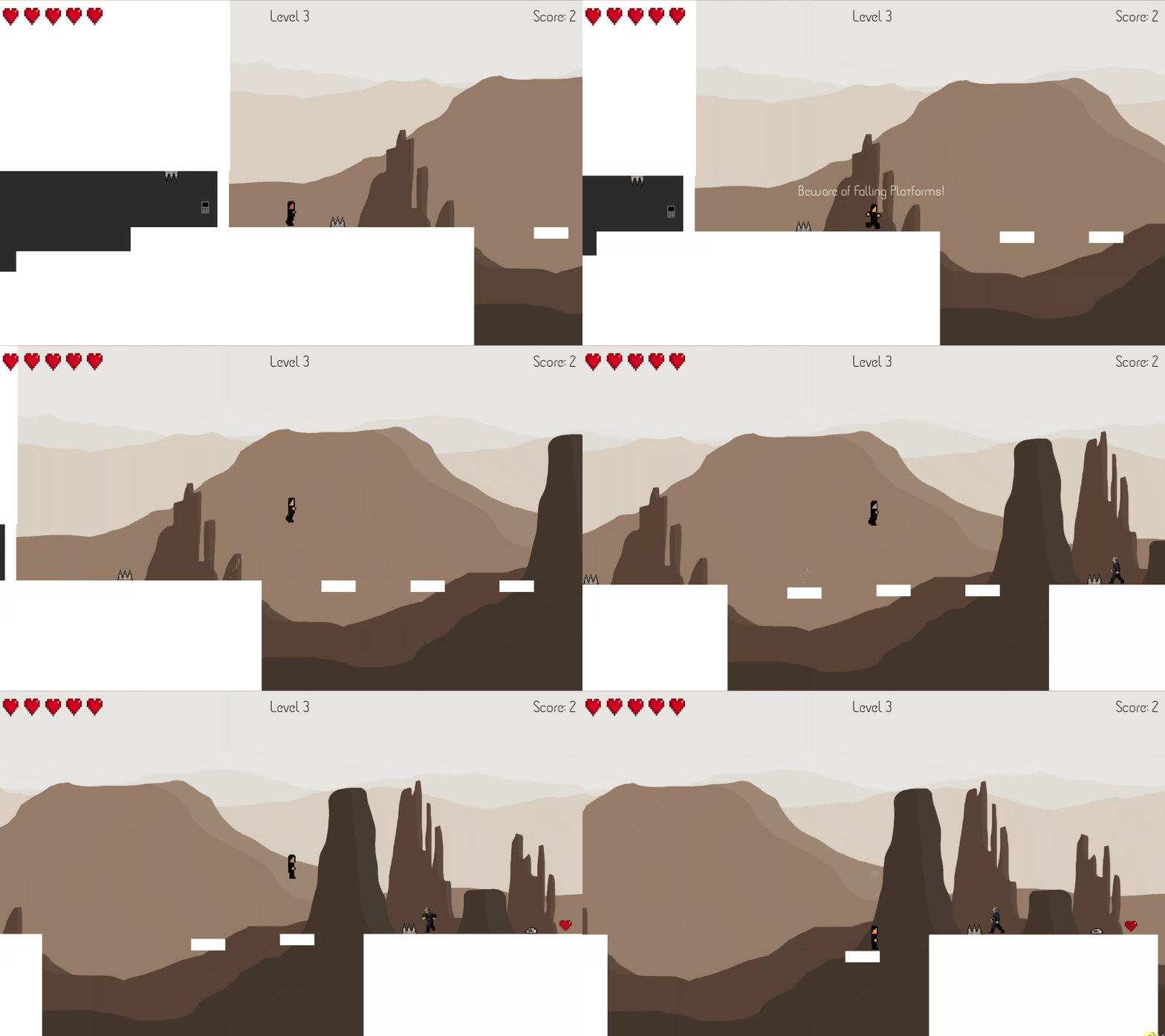
Some people have mentioned having some indicator that warns you about certain obstacles – like the falling platforms, whereas some people like the surprise of what the obstacles can do. Regardless, I have made a text that appears before such obstacles to warn players as shown in the GIF below:
However, this feature may not be included in the final product of the game, depending on feedback from people.
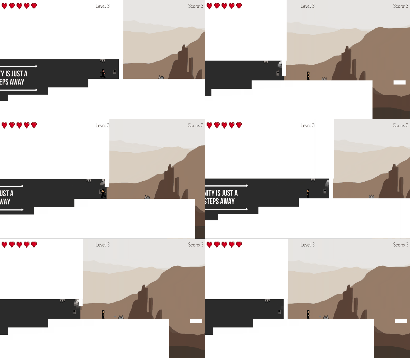
Additionally, a "hydraulic steam effect" has been added to some of the doors in Level 3 to make it seem realistic and futuristic, like how a door opening in a lab would be portrayed as shown in the GIF below:
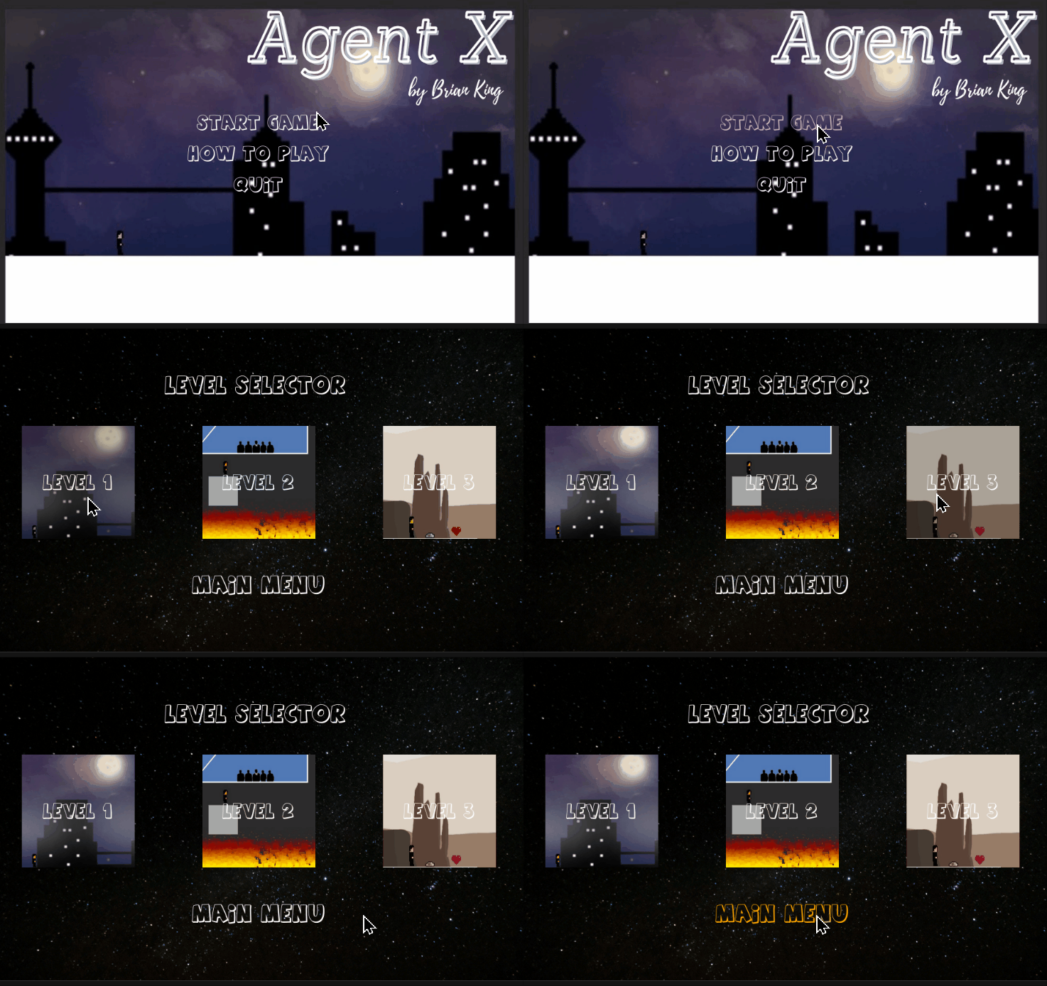
Besides that, I have also made the images on the Level Selector slightly clearer, and also make the button highlight slightly more visible when the player hovers their cursor over a button. This is demonstrated in the GIF below:
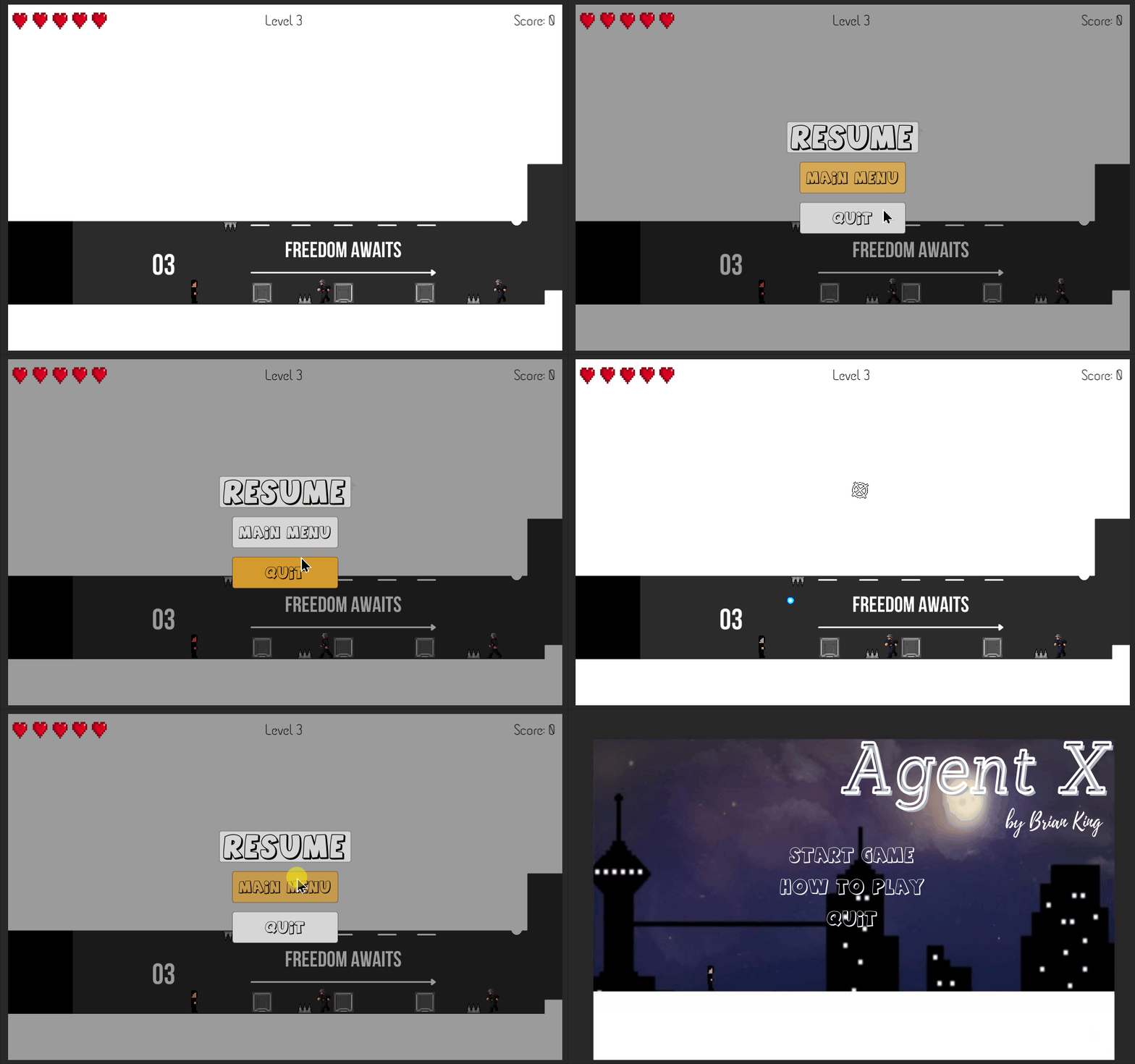
Additionally, a pause menu has also been added by which the player can press "ESC" to pause the game. The pause screen consists of 3 buttons: "Resume" that unpauses the game, "Main Menu" that takes the player back to the title screen, and "Quit" which quits the game.
Feedback
Maybe reduce the whiteness of the platforms, as they can sometimes be a bit striking.
I have now reduced the white colour of the platform from a perfect white (255, 255, 255) to a slightly less bright colour (230, 230, 230).
Bullets should go through the spikes.
I have made a new layer for the spikes, by which the bullets cannot collide, thus enabling the bullets to go through the spikes.
UI and particle effects are looking just right.
Health placement looks good, as well as the score and level.
Thank you to everyone who has provided me with feedback to improve my game!
References
All new art assets are created by me, using <https://www.canva.com/>.
Files
Agent X
| Status | Released |
| Author | brianSansBrain |
| Genre | Platformer |
More posts
- Documentation + User GuideOct 15, 2021
- DevLog 6 TestingOct 15, 2021
- Game TestingOct 06, 2021
- DevLog 4: Presentation and GraphicsOct 02, 2021
- DevLog 3: Enemies and InteractionsSep 24, 2021
- DevLog 2: Basic Level BlockingSep 16, 2021
- DevLog 1: Player MovementSep 09, 2021
- Game ConceptAug 26, 2021
Leave a comment
Log in with itch.io to leave a comment.